"Design!" He cursed.
I understand trades-off. I understand "design." And I understand why designers have to be careful—sometimes agonizingly so—to design products with cost or other constraints so that they meet utilitarian and aesthetic goals.
But
I get very cranky when I am the victim of "designs" in which aesthetics interfere with utility or when no trade-off is necessary to make a product better. Do I have examples, trivial and otherwise? Of course I do. Let's start with the trivial
| Behold this yummy 6*6 Godiva truffle matrix. There is no special message hidden by either the full vs. empty locations or by the particular truffle color or composition in each. (And no surprise as to why some locations are empty.) The point of this photo is to demonstrate convincingly that it is indeed a 6*6 matrix and that it is, therefore, square. | 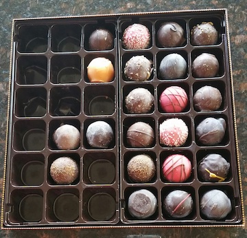 |
| As received, there is a cover on the box which also appears square. | 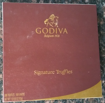 |
| But is it square? No! Re-orient the box cover by 90 degrees and attempt to re-install it. You can't, or possibly can with some puzzlement and difficulty. Both arise from the fact that, for no obvious reason besides design malice, the box and cover are slightly, almost imperceptibly longer in one dimension than the other. | 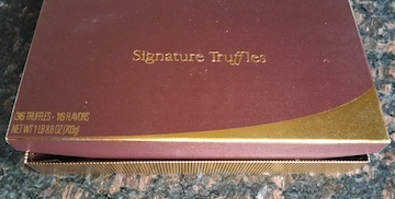 |
Q: Are you serious? Are you really wasting our time with this trivial example of what you say is bad design?
OK, maybe this isn't the worst-ever case of bad design. But I'm annoyed at Godiva for not printing my truffle "review" in which I explained how to save 50% on chocolate purchases on their web site. I wonder why they didn't. |
|
Here's One You've Seen Before
| Every once in a while I come to my computer and an error message greets me. Whether or not you've seen this particular message before, you nod knowingly. What job? What destination? Would it be such a challenge to provide the information that the program obviously has? Apparently so. I'm running Windows 10. It's not like Microsoft hasn't ever had this issue come up. Oh yes...You still can't copy and paste the text of an error message, despite the obvious desirability of being able to do so when requesting assistance. Grrrrr. | 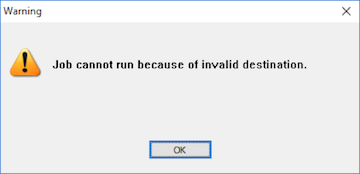 |
And One You Probably Haven't Seen
When my company upgraded to an IP phone system, I received this Toshiba telephone. Anywhere in the world it can plug into an internet jack and a wall wart and give me a "local" extension as if I'm at my desk. Miracle, right?
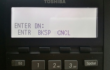
Right. Except that the software is so poorly designed that you practically have to memorize a telephone number before you can manually dial it. If you look away from the phone to get the number for more than a couple of seconds, it decides you're wasting its precious time and aborts the call. Just as bad, if you lose your internet connection for a moment, the phone isn't smart enough to reconnect. Instead, you have to cycle power and after a minute or so of rebooting you have to ENTER DN: This happened on a weekend and I had to wait two days to call the phone system guy to find out how to ENTER DN: It turns out that with all the white space on the screen it never occurred to them to write ENTER EXTENSION #, which apparently is what DN is. |
 |
This Toshiba phone suffers from a remarkable number of infelicities. An example: It can't remember your volume setting and you have to enter it for every single call. Another, which is only a minor nuisance for customers but a big money-waster for Toshiba. They seem to stock two different versions at, of course, two different prices, with the attendant inventory hassles. The big distinction? One has a backlit display.
OK, so I'm perpetually annoyed at the poorly thought-out software in a telephone that I really don't use that much since nobody makes telephone calls any more. End of the world? Not for me, but consider this: The recently bankrupt Westinghouse division of Toshiba makes nuclear reactors.
And More
My pet, Peeve, is print that is too small to read despite an abundance of space to make it larger. I mentioned this years ago in my whiny complaint about the Ford Escape Hybrid panel. But since I'm being whiny today, here it is again.
Plurals
Not quite rising to the level of crankiness, but perhaps to that of minor irritation, is the me-vs-the-world aspect of pluralization. I was going to leave "trades-off" without comment; it's obvious that the world is wrong in characterizing these necessary compromises as "trade-offs" and perhaps one day my usage shall prevail. I've already gotten at least a thousand millireaders to eat "lefts-over." But moments ago, when checking the spelling of my Now Playing tune, I became curious about how one would pluralize the name of the band, a doubly-hyphenated term that refers to a thing even though the name is noun-free. I finally decided that normal usage, i.e., "Merry-Go-Rounds" should prevail. While I was making that decision, I realized that one can't properly pluralize the name of the band any more than one can say "Led Zeppelins" without committing a solecism. How strange are language.


