RIKLBLOG
|
| Tomorrow |
| 04 Feb 2008 |
| Yesterday |
| Index |
| Eventide |
| SETI League |
| PriUPS Project |
| Bonus! |
| Contact |
RIKL REVIEW - Ford Escape Hybrid Navigation and Entertainment Display
A Thousand Miles
I promised you. I promised myself. And I kept the promise, even though you weren't aware of it. This tacit promise was that I wouldn't whine about antifeatures in the Ford Escape until it had at least a thousand miles on it. I replaced the ancient, ailing Audi wagon with the Escape Hybrid in December, and a major consumer purchase such as this one cries out for a RIKL Review. A thousand miles is enough of a chance; herewith begins my whine.
Scope of this RIKL Review
The Ford Escape Hybrid is, so far as I can tell, a fine vehicle. I've been getting about 30mpg, which is good for a small SUV. My particular vehicle is blue, so I'm happy with the color. I haven't noticed any "out-of-the-box" problems or defects, and it's started up every time I turned the key. So far so good, although not much of a test since "so far" is a thousand miles. The story may change after I've had it for a while, and the story will be augmented once I've had a chance to do the PriUPS trick on the hybrid system, assuming it can be done at all. Look for more on the latter this spring when it's warm enough to work outside.
Since I don't have anything meaningful to say about the Escape, I will turn my attention to the entertainment, navigation, and cruise control, three aspects with which I have both familiarity and exemplars for comparison. This may seem a pretty limited scope for a review of a multi-kilobuck vehicle. But consider that, beyond looking out the window for potentially intersecting vehicles and terrain, you give these systems more consideration and attention than anything else. If you're unhappy with their interface and performance, you're likely to be dyspeptic about the whole driving experience and vehicle.
I'm Unhappy
Worse, I'm unhappy for really stupid reasons. Stupid on Ford's part, that is, hardly mine! As you read my comments, please keep in mind that the cruise control works perfectly well, the sound system sounds good, and the GPS is as remarkably accurate as pretty much every other GPS. Why the whine, then? Because as they designed the user interface, the people in charge weren't thinking. I'd like to believe that at least a few of the dollars I spent on this car would have gone to pay the designers to think.
Also, as you read my comments, keep in mind that I'm not fighting with the reasonable "it is what it is" aspect of the systems. I know some luxury cars have adaptive cruise control with radar; the Escape Hybrid doesn't have and never claimed to, nor do I expect it. I don't expect a hand to come out of the map screen and grab the steering wheel to keep me on course — I recognize that as my responsibility. What I hate and what rankles is the sheer obtuseness of a few user interface characteristics that could have been made so much better. What's more, the cost to Ford of making these changes in most cases is literally zero. And most are so obvious that although I shall, pro forma, complain that they didn't check with me first, they really should have been able to figure this out for themselves.
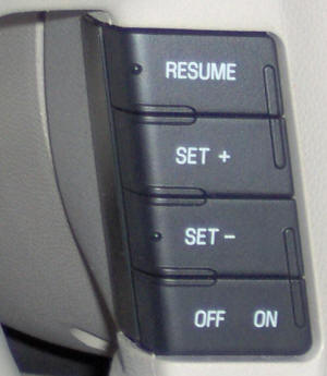 Behold the cruise controls. Five switches. Six if you count hitting the brake to shut it off. Most cars use a single control that you can press up or down or pull or push to accomplish the same thing. |
I consider the single control a benefit because you don't have to look at it to determine what it is
going to do. An up click or down click to change your
speed requires no diversion of your attention. But since
we have what we have, let's make the best of it. Despite
all the switches, there is no way to "suspend" the cruise
control, a common and desirable function, without hitting the
brake. This, of course, affects other drivers, who are not
keen to see flashing brake lights ahead of them. This
irritation could easily be obviated by changing the function of
the OFF/ON control, which serves no purpose at all.
SUSPEND is the same as OFF, either SET button is the same as ON.
Presto! Fixed. Another fix. For some unfathomable reason, the cruise control won't allow a setting under 30mph, and drops out if the car goes slower. Strictly arbitrary as far as I can tell. If the driver wants to set it at 25 or 20 or even lower, why deny him the ability? There's a 25mph "speed trap" road near me and the cruise control would be valuable there. Why am I being denied it by (probably) one byte of software? A bit of good news: The cruise control is very "crisp" as it is in some sports cars. If you click SET +, you can immediately feel the car going faster. I, at least, prefer this to the more gentle version that drifts to the commanded speed. |
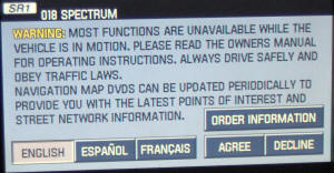 |
A step forward for the Prius, a step backwards for Ford. You no longer have a "disclaimer" page and button that must be pressed to use the navigation system in the new Prius. Not only does Ford require one, it reminds you that the system is largely useless when moving. That might be sensible but for one thing: There is no provision to allow a passenger to select addresses, program the system, etc. Hence this perpetual time-wasting irritation. Perhaps an export version operated away from the United States hypertrophied legal system is different. Grrrr. |
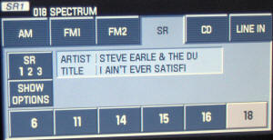 |
Where's the rest of it? The panel provided to display
the text giving artist and title could easily be larger.
But since the description seems to cut off before the end of the
panel, I can't say for sure that it's the fault of Sirius for
not transmitting it or of Ford for not permitting longer
messages to be displayed. Let's agree that both are
being silly here. And another thing: The preset numbers, corresponding to Sirius channel numbers, are wholly uncommunicative. Why not use the 14 characters available to show the name of the channel? Instead of 18, why not "SPEC-TRUM"? |
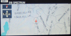 |
When using the map function, the title and artist is covered by the map. While this is unavoidable, there's still space to display the information. Notice at the very top is the legend "018 SPECTRUM" which is one of the Sirius channels. There's no need to display that — you selected it yourself, and it doesn't change unless you change it. Why not put the artist and title here instead of displaying static and not very useful information? |
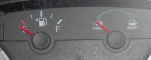 |
My Ford Escape is of the optional hybrid persuasion, no surprise there. Next to the fuel gauge is a small indicator that swings between "charge" when the battery is being charged, and "assist" when the hybrid system is supplying power. How do I know this? Well, I put on my glasses and put my nose up against the plastic to be able to read "charge" and "assist." We know Ford isn't in the best financial shape, but would it really be profligate to use a few more ink molecules to provide a legible font size in the copious available space? |
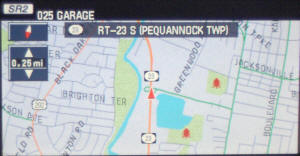 |
The worst feature of the navigation system is the map presentation. If you orient the map North Up, everything is fine. But once you select Track Up, which orients the map in the direction you're going, it gets screwy. Presumably you will be spending most of your time going forward, right? So why put the car (orange arrow) in the center of the map instead of near the bottom? Half of the map presentation is behind you! And, adding abomination to annoyance, the name of the road is placed at the top of the screen, blocking about 1/3 of the rest of the map instead of perching comfortably behind you. What weren't they thinking? |
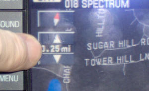 |
After shutting off most of the navigation features when the car is moving, they rendered one of the features that must be available difficult and dangerous to use. The ability to "zoom" the map in and out requires study and concentration, since the tiny size of the arrows require one to hit them with a fingernail. Steady hands, eyes off the road! And avoid hitting the compass button, while you're at it! Why not move the zoom button down and make the arrows a little larger? Or, better, put one arrow on the bottom left and one on the bottom right, where you wouldn't have to look at them since they would be tactilely located for you by the map bezel? |
One final plaint. Not exactly a freebie, but well worth the additional few dollars it would cost. Most newer vehicles, the Escape being no exception, have CD players and changers that play both audio CDs and CDs that you have "burned" with MP3 and possibly other audio files. This is very welcome since each CD has room for about ten albums instead of one. The escape 6-CD changer will thus hold about 60 albums worth of music. Why not go the logical extra step and use a drive that reads DVD computer disks? This would allow about 600 albums, or the equivalent of a 20-30GB iPod or other MP3 player to be part of the car. Instead of furnishing one's own music player and using the auxiliary input, all this music could reside in the car's disk changer. The cost difference between a CD-only player and one that also plays DVD is close to nil, and the software for reading the files is already present. (I am not necessarily suggesting that the DVD be able to play video files or movies, although the screen to display them is already present.)
I'm bewildered by the thoughtlessness of the people who signed off on most of the misfeatures listed above. Trivial things like an unreadable font and tragic ones such as the stupid map presentation should have occurred to someone! Or, as I am forever pointing out, most recently a few paragraphs ago, they could simply have asked me.
More on the Ford Escape Hybrid, probably of a more encouraging nature, in future blogitems.
|
Not as encouraging as I thought. Three years plus later, I am having feud with Ford over a brake problem that should have never been. Read about it here.
NP: "Anesthetize" - Porcupine Tree
| © 2008 |
| Richard Factor |
