RIKLBLOG
|
| Tomorrow |
| 25 May 2018 |
| Yesterday |
| Index |
| Eventide |
| SETI League |
| PriUPS Project |
| Bonus! |
| Contact |


I'd Fly All Over This Land
And, depending on which airline I were, maybe all over this world. And while I was doing that, I would provide a moving map display for my passengers' devices so they would know where in this land they were.
Why? Don't you trust the pilot to get you to your destination?
Yes, I sort of do. And I might even know when we'd arrive if more than one out of ten pilots spoke intelligibly through the speakers in the cabin. But I like to know where I am and what I'm seeing. When I get a window seat, which is almost always, I ignore the admonition to keep the shades closed. Instead, I watch while we take off and land, and frequently take in the scenery while we're flying. I'm not enough of a weather geek to log the cloud types and altitudes, but I do embody a substantial amount of curiosity about the nation flowing by below me.
 |
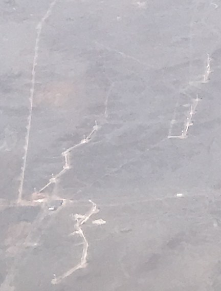
For Example:What is that feature in the photo on the left? It's the "Very Large Array," a major radioastronomy research facility. I puzzled over that photo for several seconds until I checked our approximate location and realized what it must be. |
 |
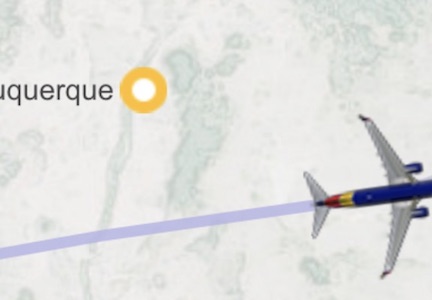
Southwest airlines does have a moving map albeit a very primitive one that showed us near Albuquerque. Wouldn't it have been nice to zoom in and be able see details of the VLA? |
 |
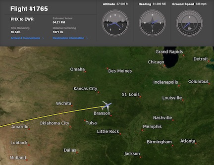
Unfortunately, the Southwest map only shows the very largest cities, has limited "zoom" capability, and isn't user-friendly at all. Actually it's user-hostile. There's almost nothing you learn from it in terms of geography and terrain features. At least you can see your altitude and ground speed. |
 |
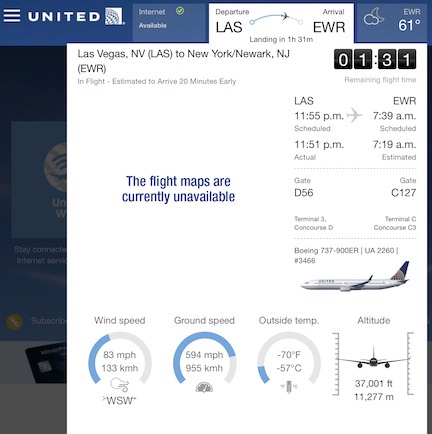
To be sure, it's not quite as user-hostile as the United moving map, which seems to have been disabled or discontinued for my two most recent flights. United does provide wind speed and outside temperature, which discourages me from sticking my hand outside to assess it myself. But why are the airline maps so deficient in utility? |
Most likely because the airlines didn't read this blogitem. (To be fair, they would have to have read it before it was written.) As I mentioned "yesterday," I believe it's in the airlines' interest to enhance the moving map feature.
Let me count, or at least bullet-point the ways it will be of benefit:
- Gives the passengers something to do beyond fidget and whine
- Teach the younger passengers a bit about geography
- Teach the older passengers a bit about geography
- Generate interest in the process of flying cross country (altitudes, speeds, wind effects)
- Prevent the pilots from having to pretend to point out features of interest
- And the biggie: Get people interested in becoming pilots
- It would make me a happier airline user. I might even erase the "evil airline scum" softkey.
- And, I have discovered, moving maps make the flight seem to go faster!
Gamify! Aerify!
Although I mention "maps" in the customary sense—geographic features of the land—it would be simple to add what they call another "layer." Just as Google maps allows one to see just roads without clutter for driving purposes, aeronautical moving maps eschew clutter such as cities for flying purposes. They have, instead, airports, navigational aids, so-called "special use airspace" reserved for the military and other purposes, and other items of interest to pilots. Geography could be on one layer, aeronautical data on another, either or both selectable by the user. And if all this watching is too passive, the map could be "gamified," allowing the user to "fly" from one airport to another while in his too-cramped, middle seat.
Additional advantages include simplifying the transmission and reducing the bandwidth of data sent over the shipboard WiFi system. Right now, the map itself is transmitted from the aircraft to the passenger's iPad or whatever. With a proper downloadable app, all they need to do is transmit latitude and longitude along with the flight information such as speed, heading, altitude, etc. and the app will draw the map graphics.
Convincing the Airlines
Airlines seem to be notoriously indifferent to anything that goes beyond the FAA-mandated safety of passengers. For example, Southwest has recently substituted Oreo Thins with two-molecule-thick "stuf" between the brittle crackers for the real cookies of days past. United offers something called "pretzels" without even the pretense of providing yummy empty calories. Some people find airline seats cramped and uncomfortable. I probably would, too, if I had any feeling in my limbs after the first few minutes. (Maybe one reason for the pilot shortage is the cockpit seating. You don't see a lot of tall pilots.)
Ask an airline executive why they treat passengers thus and he will explain costs of labor and fuel and FAA regulations. Some of the discount airlines that used to nickel-and-dime you note that they've started diming only, since nickels weigh too much and cut into profit by increasing the cost of fuel.
The good news about the benefit of moving maps is that it won't eat into profits. It won't add to labor costs beyond the one-time development of the app. It won't require interaction with the FAA as it isn't safety related, and the transmission of data is one-way from the aircraft to the passenger, with no opportunity to respond. (Yes, it would be fun to have all the passengers use their app to vote on the altitude and heading to fly, but that's just not practical.)
So, if I were an airline, I would write or buy an app with a detailed map of my service area. I would connect whatever interface I'm now using to transmit the crappy maps already available to a data stream that provides the location to that app map, and sit back and wait for the new stream of people interested in the aviation trades to apply for the jobs I haven't been able to fill.
Saving the World*
You may have noticed that when people have plans to save the world through their ideas, they tend to overstate them a bit. And, of course, I'm doing exactly that. Or am I? Certainly turning a boring, tedious cross-country flight into a bit of an adventure can't hurt. Will it help? I don't know. When I fly, I'm usually the only one in my seat row availing myself of the map feature. Rarely does a seat-mate ask any salient questions about what I'm doing or why. On the other hand, they rarely get up and leave. If a properly featured moving map were available instead of the rudimentary (or non-existent) ones we now have, at least some people would find them useful and interesting. And at least some of them might decide that—hey—I could actually control the tiny airplane on the map if I learned more about this! Would that be one per cent of the passengers? Unlikely. A tenth? Maybe. A hundredth? Probably!
But even if it's only more than none, and I'm sure it will be, the airlines will come out winners.
And so will I! I've been whining about the crappy maps for years.
* I know I'm exaggerating. The airlines are hardly The World. But I actually do have a notion to Save the World. It involves solar power.
| © 2018 |
| Richard Factor |
NP:
|
|
TotD The Mohonk Mountain House is in the Hudson Valley in New York. This is, I'm told, a lovely facility. They host conferences and offer opportunity for outdoor recreation. No, I've never been there. Yes, I have the T-shirt. |
 |