RIKLBLOG
|
| Tomorrow |
| 19 Dec. 2008 |
| Yesterday |
| Index |
| Eventide |
| SETI League |
| PriUPS Project |
| Bonus! |
| Contact |


RIKLReviewTM — The BlackBerry Storm (Part 2)
Secretarial Skills
As does almost everyone nowadays, I learned to type in grade school. But I'm probably older than you are, and I went to grade school in the 50s. Which means I learned to "touch type." On a "typewriter." Which had lots of moving parts, and jammed, and needed to be cleaned. To this day I can "touch type" on a standard QWERTY keyboard, to the consternation of some of my cohorts who expect me to stop typing when I look up to have speaks with them. (Yes, of course I do it to annoy them.) Touch typing, the ability to spell most words the same way every time, and a fairly comprehensive appreciation of the different forms of the infinitive "to be*" would highly recommend me for a job as a secretary, if companies could afford such any more.
When I got the Motorola Q with its tiny keyboard, touch typing was right out. Even so, I managed to adapt to it fairly quickly. I made few errors and could find the alphabetic keys easily and the symbol keys with modest difficulty. When I got the Storm, I forced myself to try the three different typing methods on the touchscreen, although I was fairly certain I'd prefer the QWERTY keyboard obtained by holding the phone in landscape mode. So I did, and I doubt that I'll have much to say about the other modes. In fact, I'd ignore them completely except that sometimes it's more convenient to use the Storm in portrait mode. Switching between portrait and landscape is a bit of a nuisance. It feels slow. Whether that's a software issue that will be resolved with an update or an ineluctable problem involving CPU speed, only BlackBerry knows for sure.
Let's Do The QWERTY
QWERTY typing is, in my opinion, and based on only brief usage, neither easier/faster nor harder/slower than using the tiny mechanical keyboard on other smartphones. When I tried it initially, I kept hitting the wrong key. When you lightly touch the screen, a festive blue glow surrounds the key in question. Of course, your finger is covering the key, so it can be hard to see without a bit of a sidewise glance. Also, the keyboard is slightly less responsive than it might be, especially when moving from one key to the adjacent one. But this is a quibble, not a real flaw. Within an hour or so I was typing like a pro, albeit a pro who types at 10 words a minute and makes a lot of mistakes. One annoyance: When entering a password the requisite two times, you can't actually see your errors, so if you get a "passwords don't match" error, you have to go back and do them both over. A "don't mask passwords" option might be valuable, especially for beginners.
If BlackBerry had asked me (and especially if they paid me) I would have offered a couple of ideas to improve the usability and speed of the QWERTY touchscreen typing experience. The first would be an extension of the "word completion" feature found in other cellphones. It tries to guess what you are typing based on a dictionary of common words and on what you have typed previously. Sometimes it guesses right, in which case you go to the end of the word and start on the next. If it guesses wrong, you keep typing until you either finish the word or it does get it right. Sometimes I found this convenient on the Motorola Q, sometimes it was a minor irritation. There's no reason the Storm can't use this feature with the QWERTY keyboard since it's already built into the phone. I'll leave it as an exercise for the "software writers" to make the user interface intuitive.
Do the Improved QWERTY
I've never seen this suggested before, possibly because touchscreen QWERTY on a tiny screen is so new. (Other possibilities, of course, include my not paying attention, and/or that it may be a stupid idea.) All languages have more- and less-frequently used letters. You've seen "ETAOIN SHRDLU," I'm sure, which is, in order, the 12 most frequently used letters in English. Morse Code takes advantages of these probabilities. "E" is a single short dot, "T" is a single dash. "Q," used far less frequently, requires three dashes and a dot to send. On a large keyboard where there's little chance of a mistake, all the keys are the same size. On a computer screen, especially a small one, there's no law that requires them to be. What if the Storm software combined the English letter frequency tables and the word completion feature and adjusted the key outlines to make the correct key easier to hit? If you get a little seasick thinking about the keyboard changing like that, realize that it isn't necessary to modify the key outlines at all. Rather, adjust the active zone around each key so that if the next letter is very likely to be, say, an "H", then make it an "H" rather than any of the surrounding letters if your finger lands somewhere in between. This would make typing faster and easier, especially for beginners or people with fat fingers.**
The Beautiful Screen
So why the touchscreen at all if a keyboard has about the same usability? Beauty! Yes, the Storm screen is beautiful. My definition of beauty involves about 80% resolution and 20% everything else. I have read that the Storm screen has better resolution (480*360) than the iPhone (480*320). Every pixel is sacred! And bright and clear and legible. Which is one of the main reasons I bought it, so I'm glad I like it. I've read studies that claim larger monitors increase productivity by 10-30%. That has to be true when going from a small screen to a larger one on a cellphone. Just avoiding all that panning and scrolling and even some downloading is a time-saving boon.
I didn't make any measurements, but I did use the Storm outdoors and was surprised how legible it was in indirect sunlight. The screen is a winner!
Review Comparisons & User Interface Summary
As did many of you, I read a number of breathless reviews of the Storm before I bought it, and a number of semi-scathing ones as well. I have the advantage of a slightly later (by weeks) software version, and I think it is fair to say that there are no insurmountable or even serious problems with the Storm UI. Clearly it takes getting used to. Most likely I will have the Storm for about two years, and so far I've put only two days into working with it. Although you will probably be satiated with RIKLReviews before December is over, I'm going to sneak back with an update in 2009 after living with the Storm for a longer period.
Other reviewers justifiably made their biggest fuss over the UI. And, of course, it's the first thing you encounter and have to accommodate to let you get at the utility of the phone. But after a while, hopefully a short one, the real reasons for owning the phone come to the forefront.
-
The music player (works, more later)
-
The camera (works, more later)
-
The GPS (works, more later)
-
PC Integration (somewhat better/worse than the Q, more later)
-
Morse Code ring tones (easy!)
-
Voice notes (where did it go?)
-
The clock (where are the seconds?)
-
Data modem (I think it's faster)
-
And a host of others
I'll try not to do a blogitem on each one. I don't want to run out of month. Oh yes. I discovered it can also be used as a cellphone. Someone actually called me.
*Which, I just discovered, is called a "copula."
**I'm not sure if it's politically correct to say "fat fingers."
I hope I got away with it.
|
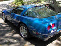
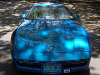
Special Advertising Section Please buy this lovely blue Corvette ZR1!
|
 |
NP: "Frozen Love" - Buckingham Nicks
| © 2008 |
| Richard Factor |
